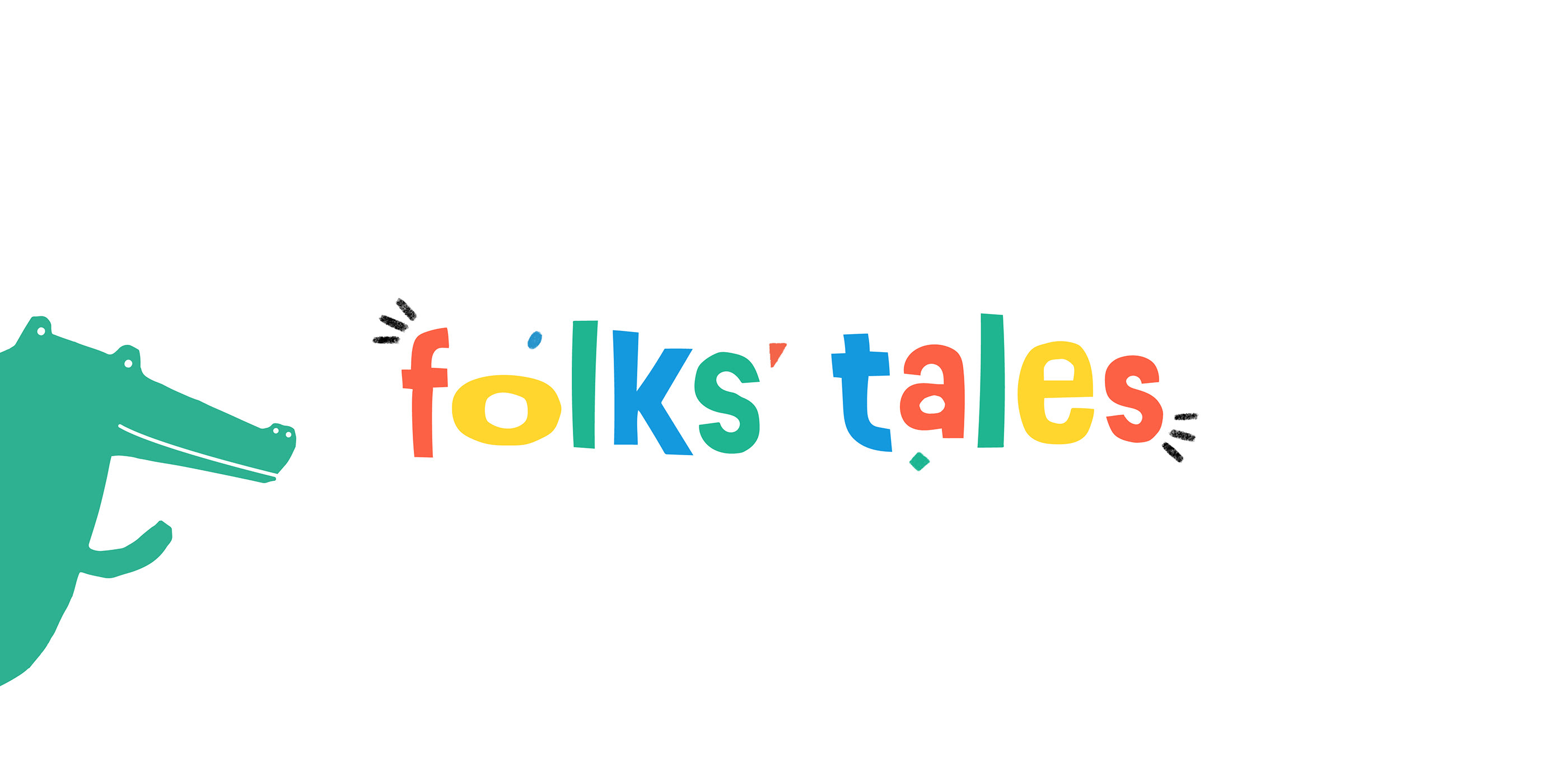
Folks' Tales
Folks’ Tales is a digital collection of South African fables and crafts
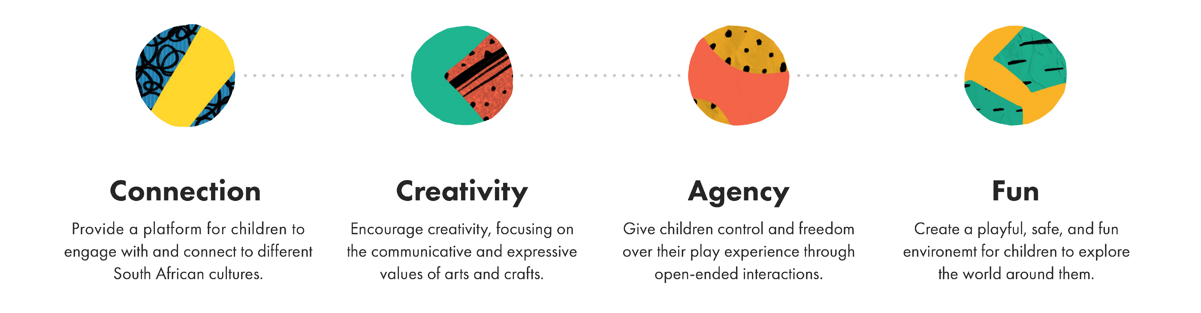
that sparks connection through creative play. The application provides a platform for children to engage with and
connect to various South African cultures by using storytelling, drawing, and crafting to cultivate
social awareness.
Our app is designed for South African children between the ages of six to eight. The different
difficulties of the stories encourage children within this development stage to expand their
knowledge while they play along. Folks’ Tales is available to any child who has access to a
phone or other digital device.
Project scope and timeline
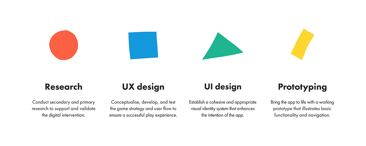
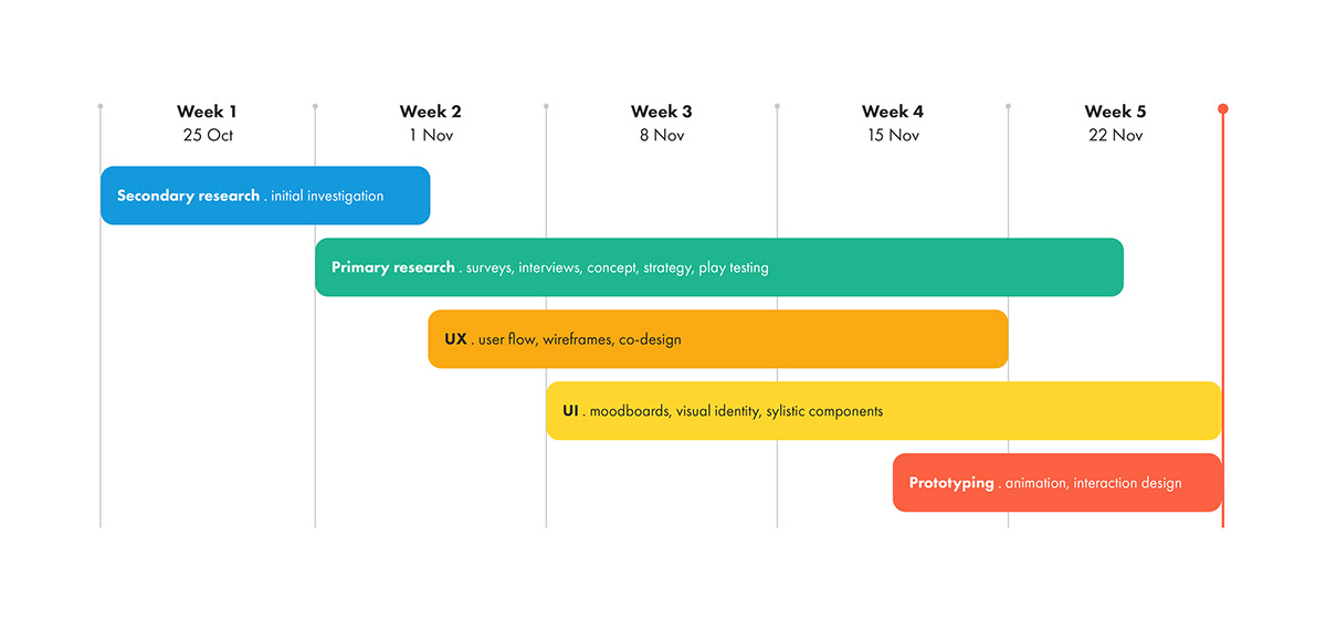
The project involved various research and design aspects to develop an effective digital solution. We began by establishing the scope of the work at hand which helped us define our project goals and determine what was feasible to achieve.
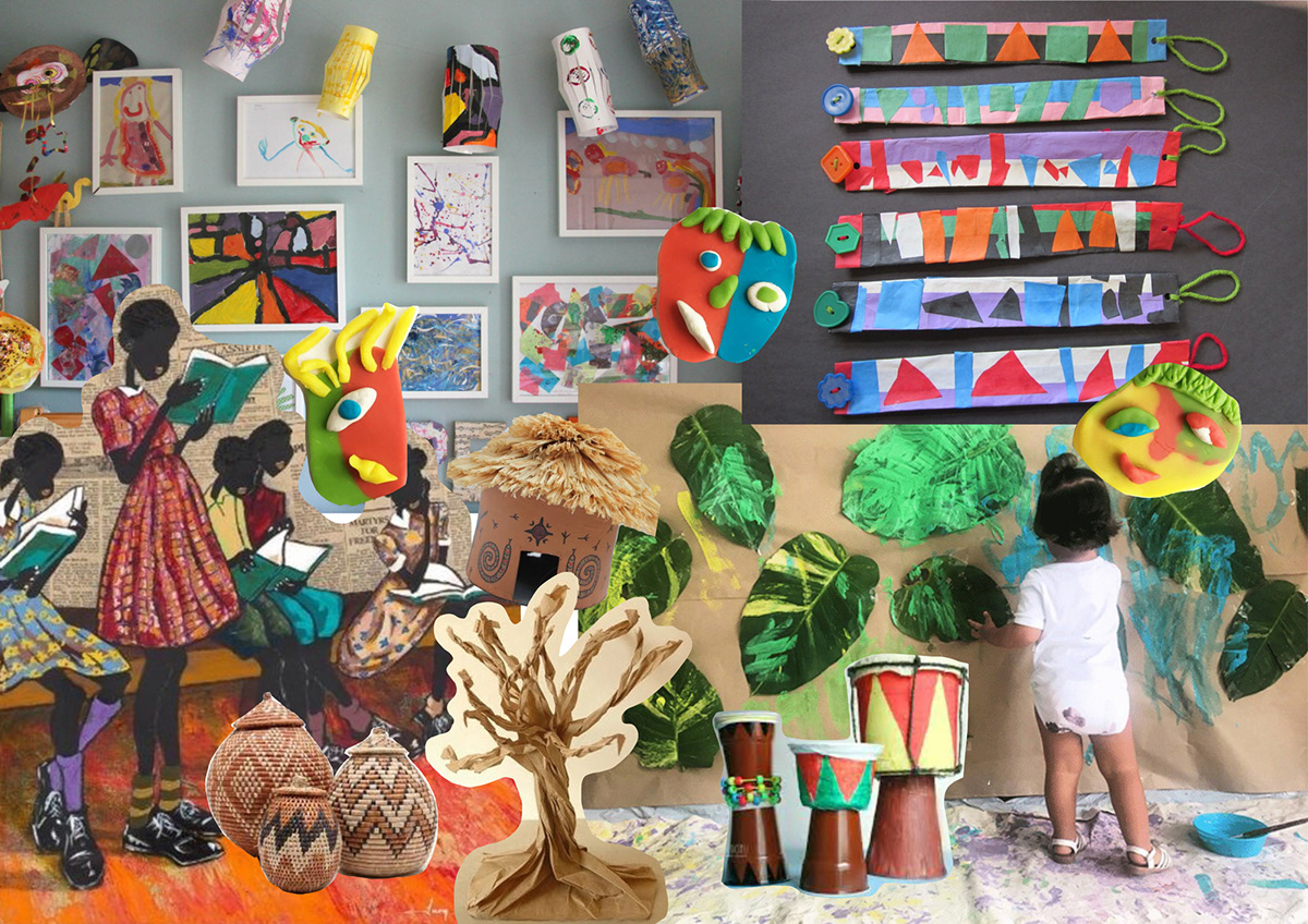
Concept moodboard
We researched South African themed arts and crafts projects, and various traditional fables to develop the game concept.
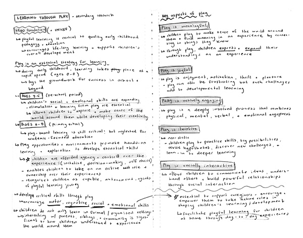
Research
Primary and secondary research was fundamental in our app development, allowing us to support and validate our game. The initial research phase helped to identify an appropriate and relevant topic for the digital intervention.
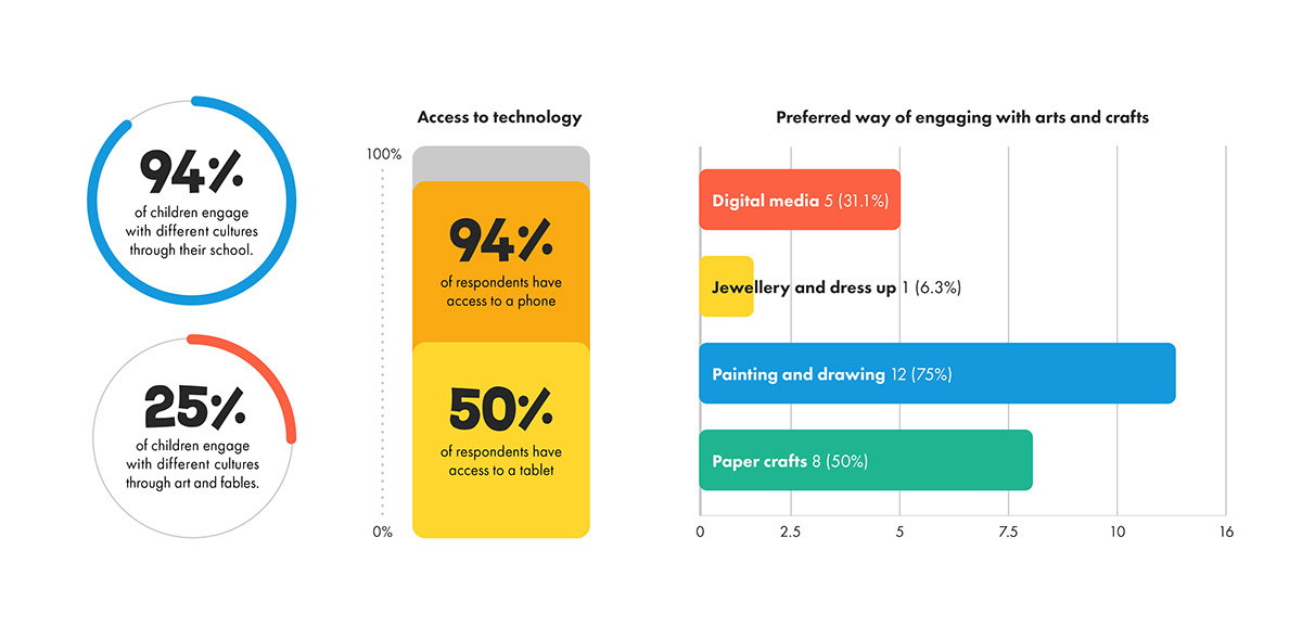
We began our primary research by conducting an online survey for child caregivers. The survey comprised of quantitative questions to provide statistical information about our target demographic, preferred types of play, and access to supplies.
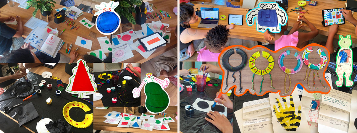
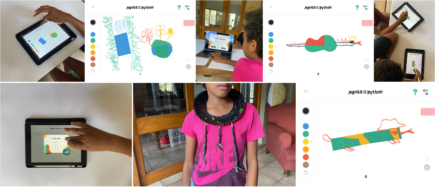
We conducted multiple play testing sessions to research, test, and iteratively design Folks' Tales. Our play sessions involved engaging with an analogue prototype of our digital intervention; we used storybooks, drawing activities, and a crafting project to emulate key aspects of our app and gameplay.
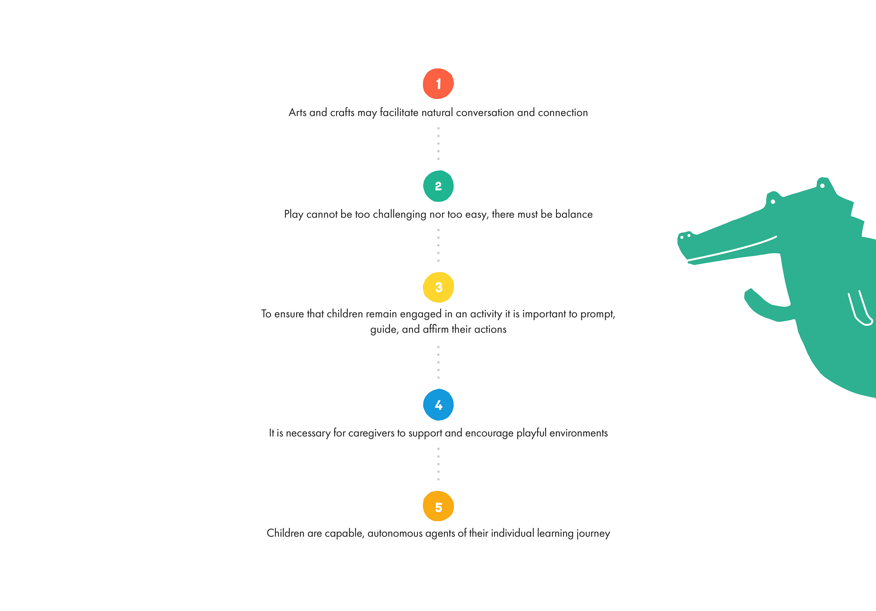
Key insights from the research
Project goals
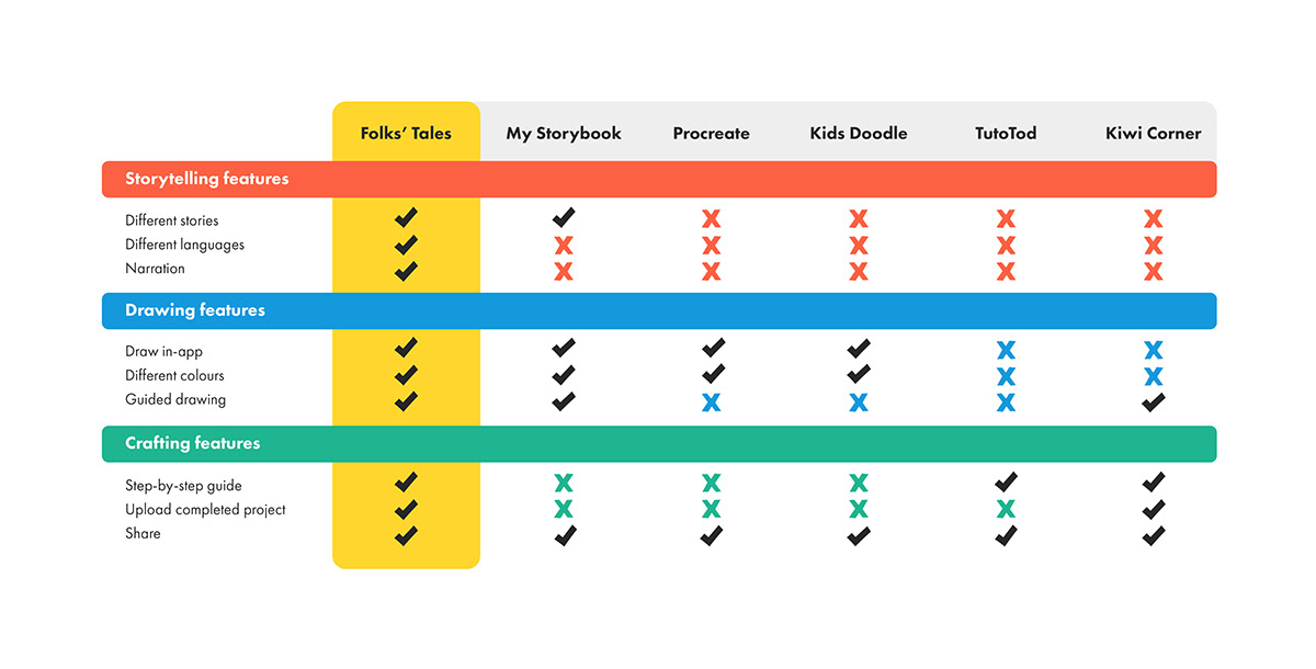
Competitor feature map
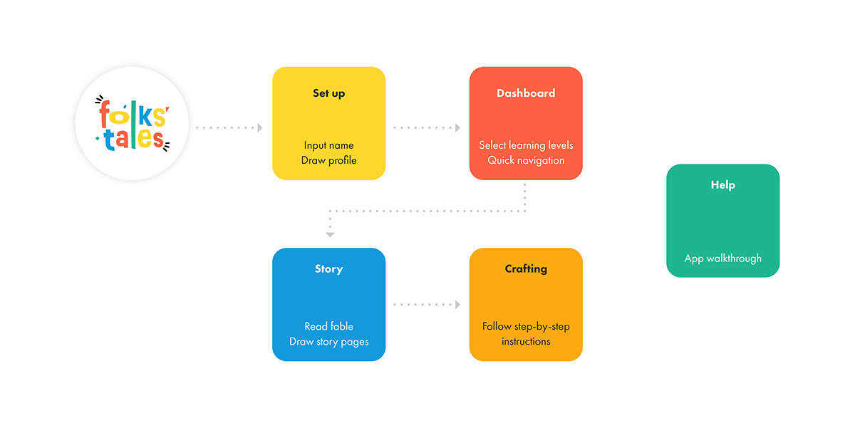
User flow
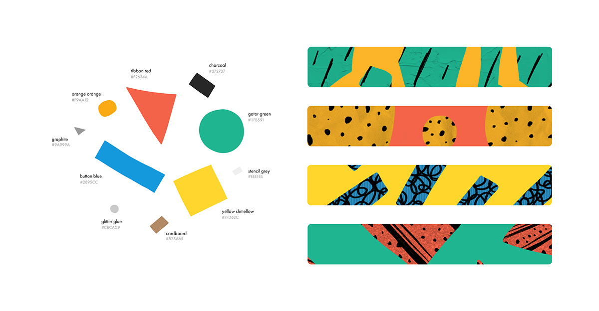
User interface
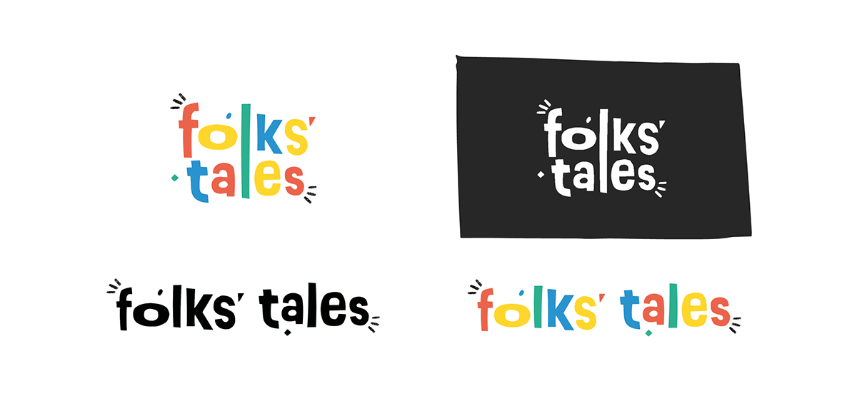
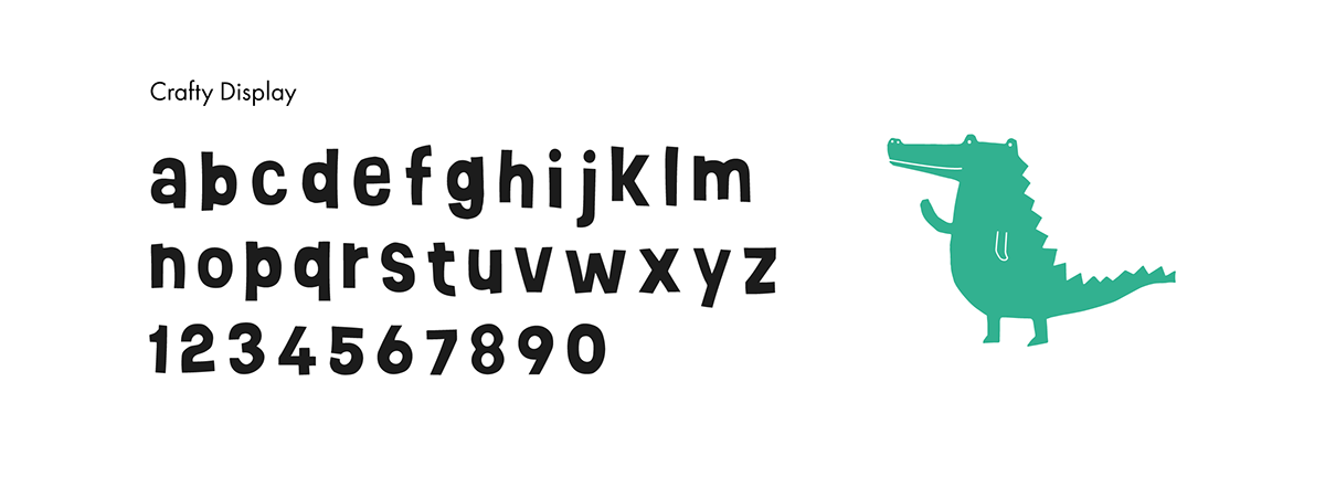
Folks' Tales typography consists of Crafty Display paired with Futura PT. The hand-cut font reflects the fun and creative feeling of the brand, while Futura’s modern sans serif ensures readability throughout the app.
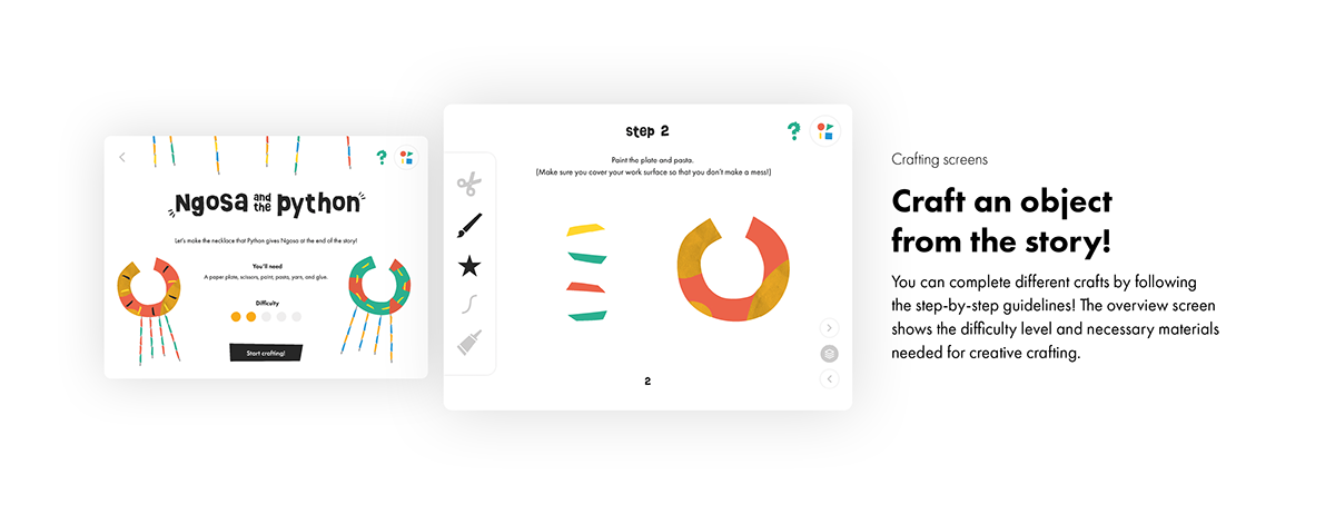
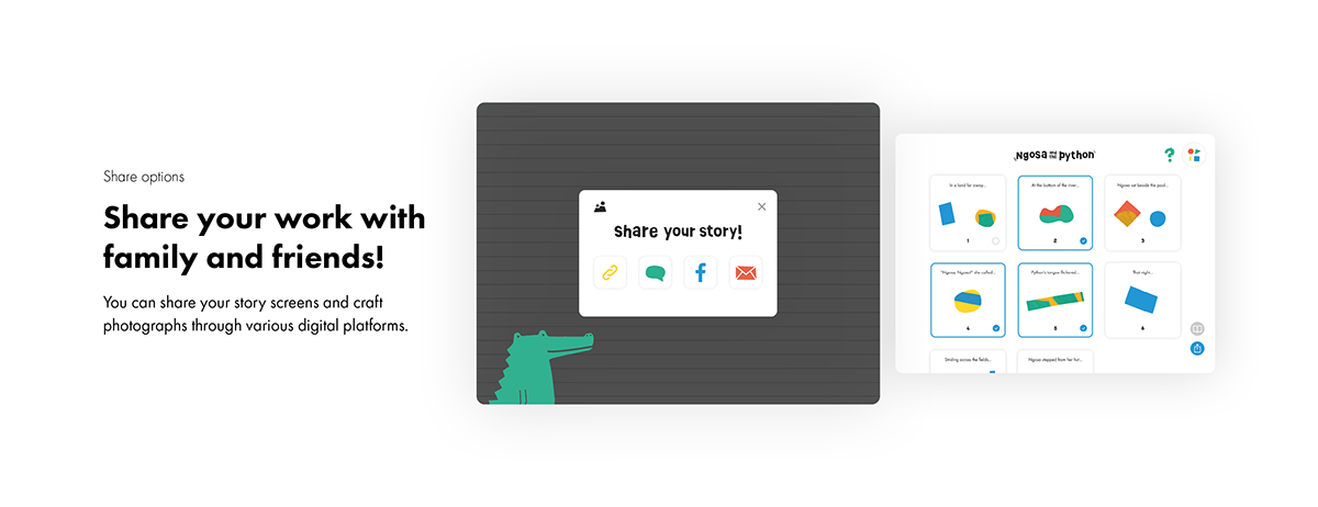
Final outcome
Play Folks' Tales!